Outside of my more work-oriented Daily Note, I store what I call Logs in a separate Archive folder. In it I'll track things such as routines or habits I want to build, the mood I'm in, while making space for more generic entries. It's a fairly standard "Journal" template, but I found that after a few days, I wanted to visualize how well I was staying on track. This is where I took a bit of a dive into the world of Obsidian Charts.
Obsidian Charts is a Community Plugin that is free to use. It hooks into Chart.js, an open source JavaScript library to create some beautiful and dynamic charts on the web. Being in JavaScript, this is a little more advanced, but bear with me.
To start, you could use your Daily Note if you've configured it similarly to my Logs, or you can create a fresh set of notes to follow along with. I'll share the code below separately.
What You'll Absolutely Need
- Dataview
- Obsidian Charts
You'll need to use Dataview in conjunction with Obsidian Charts, otherwise you won't be able to query your Vault. Outside of the default configuration of Dataview, there's nothing you need to do.
What You Might Need
- A separate file to display your charts. Optionally, you can display individual elements of this note in Canvas.
- An optimal "Log" file configuration.
Let's use the following as an example Log file.
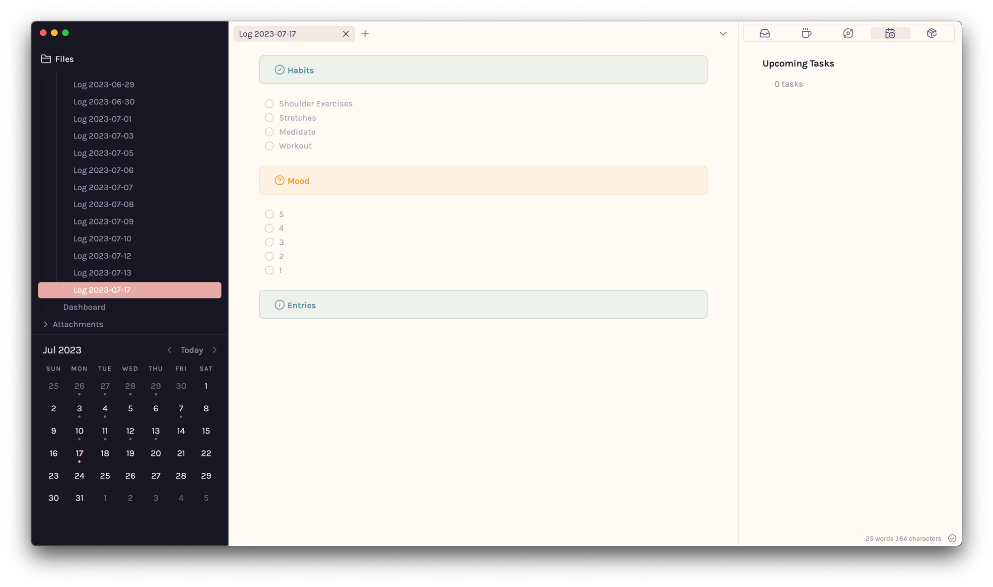
This Log is broken into three individual sections– Habits, Mood, and Entries. As you might have seen from the screenshot above, the former two are simple task lists. There might be more aesthetically pleasing ways to do this, but it's best to start simple.
Next, within my Archive (the parent folder of each Log), I keep a separate Dashboard file where I house individual charts under specific headers. This works great if you're using the Narrow to Heading option in Canvas to display individual Charts, but otherwise the JavaScript used can get a little lengthy, so it's a good idea to keep things structured.
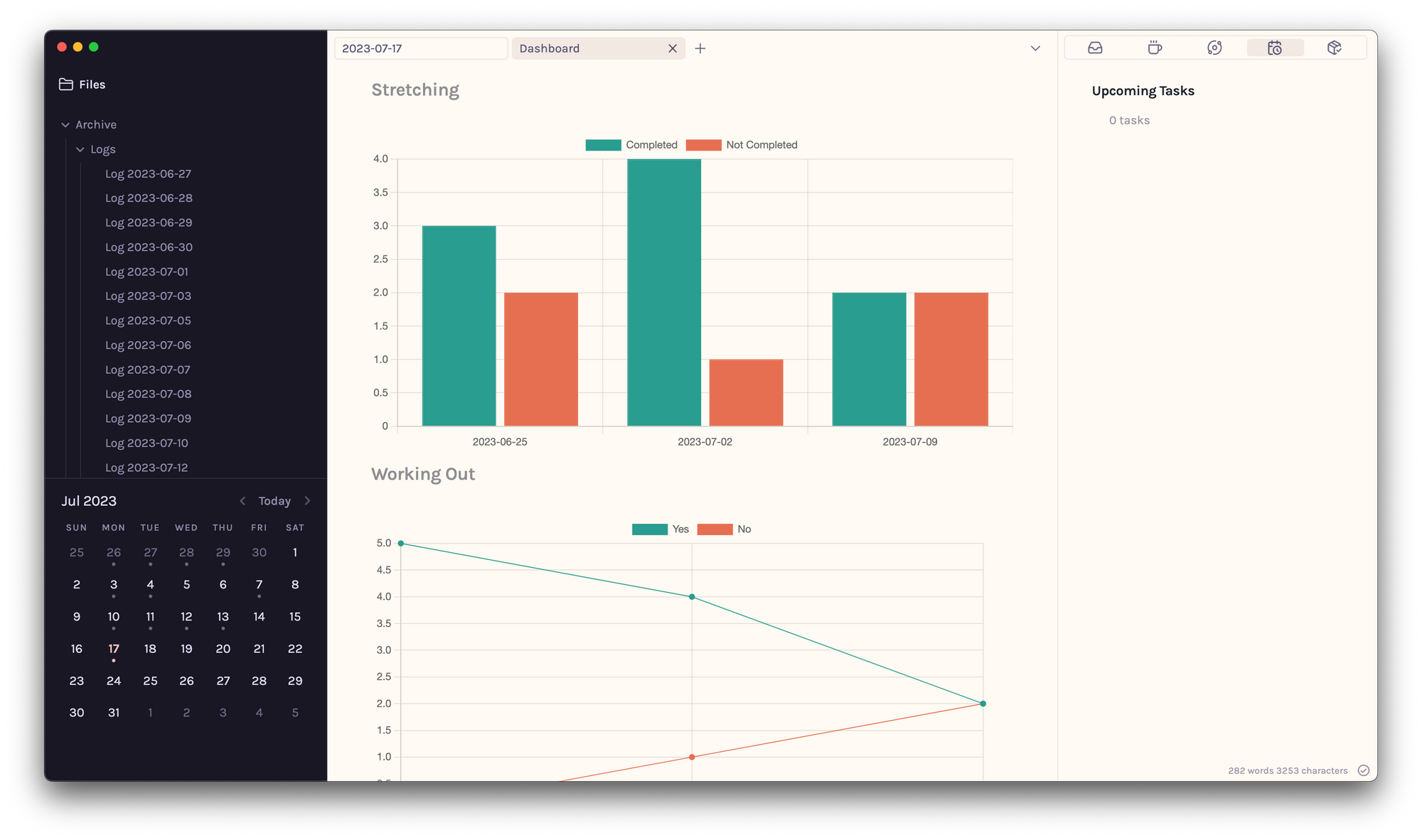
Using the example as our source, we'll start with building a simple bar chart that displays how often we stretch each week. For this to work well, each Log file must have the corresponding date that it was created within the filename (YYYY-MM-DD).
Enter the following code into one codeblock in your Dashboard file. Ensure that both Dataview and Obsidian Charts are enabled and that the code block begins with ```dataviewjs
I'll break the code into sections for clarity without getting too into the weeds. For JavaScript experts, you don't have to read this all the way through. You'll also be download the .md file below.
```dataviewjs
const pages = dv.pages('"Archive/Logs"');

const weekData = {};
The first line of code retrieves our logs from our Vault based on the location we specify. In this case, it's the Archive/Logs folder.
The second line creates an empty container called weekData. This container is like a box or a storage space that can hold information about different weeks. We'll use this in the following snippet:
pages.forEach(page => {
    const weekStart = moment(page.file.name, 'YYYY-MM-DD').startOf('week').format('YYYY-MM-DD');
    const completedTasks = page.file.tasks.filter(t => t.completed && t.text.includes("Stretches"));
    const notCompletedTasks = page.file.tasks.filter(t => !t.completed && t.text.includes("Stretches"));
    const completedCount = completedTasks.length;
    const notCompletedCount = notCompletedTasks.length;

    if (weekData.hasOwnProperty(weekStart)) {
        weekData[weekStart].completedCount += completedCount;
        weekData[weekStart].notCompletedCount += notCompletedCount;
    } else {
        weekData[weekStart] = {
            completedCount,
            notCompletedCount
        };
    }
});
This section of code is iterating over each file within Archive/Logs and performing a series of operations/steps. Here's the breakdown!
- It retrieves the start of the week from the name of the note. You must use the YYY-MM-DD format in the filename, otherwise you must modify the code to use the format you've decided on.
- It filters for the tasks in the file that are both completed and include the word "Stretches", then stores those that are completed into a collection.
- Similarly, it filters the tasks in the file that are not completed and creates a separate collection.
- It stores the count of completed and non-completed stretches.
- Each of these counts are stored per week.
With this data in hand, we'll build out the chart.
const weekStarts = Object.keys(weekData);
const completedCounts = Object.values(weekData).map(data => data.completedCount);
const notCompletedCounts = Object.values(weekData).map(data => data.notCompletedCount);

const chartData = {
    type: 'bar',
    data: {
        labels: weekStarts,
        datasets: [{
            label: 'Completed',
            data: completedCounts,
            backgroundColor: '#2a9d8f',
            borderColor: '#2a9d8f',
            borderWidth: 1
        },
        {
            label: 'Not Completed',
            data: notCompletedCounts,
            backgroundColor: '#e76f51',
            borderColor: '#e76f51',
            borderWidth: 1
        }]
    }
};

window.renderChart(chartData, this.container);
This section of the code performs operations to prepare and configure the data from the previous step in order to render the chart, including the individual week start dates (weekStarts), completed stretches (completedCounts, and non-completed stretches (notCompletedCounts)
For chart customization all I've adjusted here are the backgroundColor and borderColor. This is done by adjusting the hexcodes for these variables. For more information on the different chart types, styling, and animations, I'd highly recommend taking a peak at the official documentation and modifying the code as you go.
With only one log, your chart might be a little empty at this time but as you continue to create new log entries, the chart will dynamically adjust each time you open the file, depending on the week. Neat, right?
You can of course modify the code to work on a daily level, but I find that reviewing how my previous week went is more relevant than how my previous day went– at least in this context.
Download the full .md file below!