My Obsidian Setup: Theme Tweaks for a Productive Vault
A place I'll keep updated when I make tweaks and other changes to my Vault with the appropriate Style Settings, plugin options, and custom CSS that I'm constantly making adjustments to.

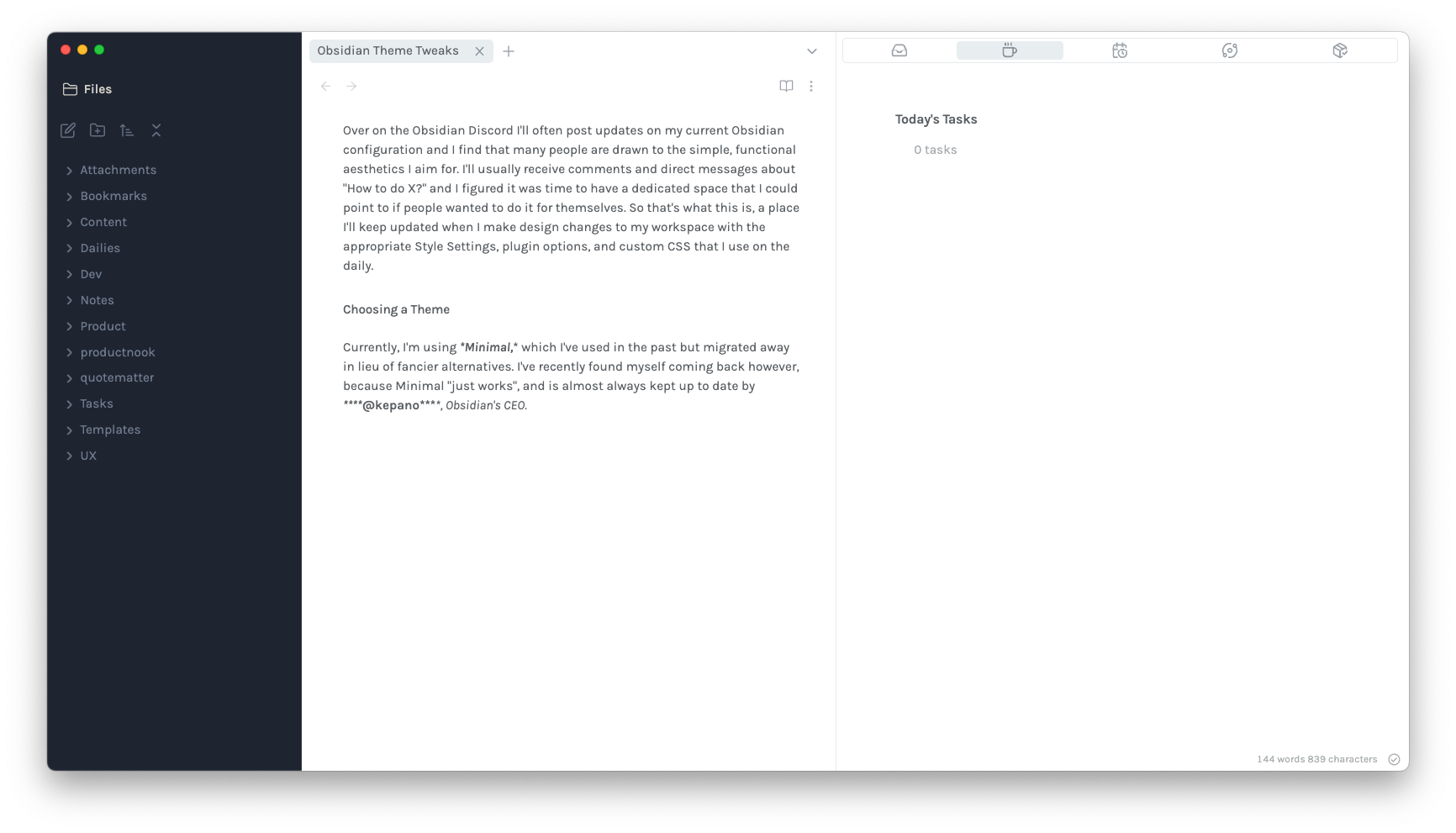
Over on the Obsidian Discord I'll often post updates to my current Obsidian configuration and I find that a good amount of the members there are drawn to the simple, functional aesthetics that I aim for. I'll usually receive comments and direct messages about "How did you do X?" and I figured it was time to have a dedicated space that I could point to if people wanted to make those changes for themselves. So that's what this is, a place I'll keep updated when I make tweaks and other changes to my Vault with the appropriate Style Settings, plugin options, and custom CSS that I'm constantly making adjustments to.
Choosing a Theme
Currently, I'm using the Minimal theme, which I've used in the past but migrated away in lieu of "fancier" alternatives. However, I have recently returned to Minimal for two main reasons. Firstly, it 'just works' without any issues. Secondly, it is consistently updated with the latest changes as it is maintained by @kepano, Obsidian's CEO. The Minimal theme stands out from others due to its attention to detail in layout, clear labeling of Style Settings, and most importantly, a focus on functional minimalism."
Cleaning Things Up: Core Plugins
Obsidian comes with several core plugins enabled by default, but I don't utilize most of them, and they often add unnecessary clutter. Here are the interface based core plugins I've left disabled to keep things minimal.
- Backlinks: I don't need it in my right-hand side bar; if I want to see connections, I'll use a Local Graph View.
- Outgoing Links: Same concept here.
- Outline: Although it could be useful for longer form writing, I have never used it.
- Search: I prefer using the Omnisearch plugin, making this redundant.
- Tags: Instead of displaying all tags together in a list, I prefer searching for specific tags.
- Word Count: I rely on the Better Word Count plugin (especially for being able to count selected words), making this plugin redundant.
With these disabled, you should really only be seeing Files in your left side bar. Optionally, you can disable the Files controls with this small CSS snippet:
.nav-buttons-container {
  display: none;
}
I've kept this disabled for now, since I like being able to create Folders at root easily, but it's there for you if you want to keep things extra clean.
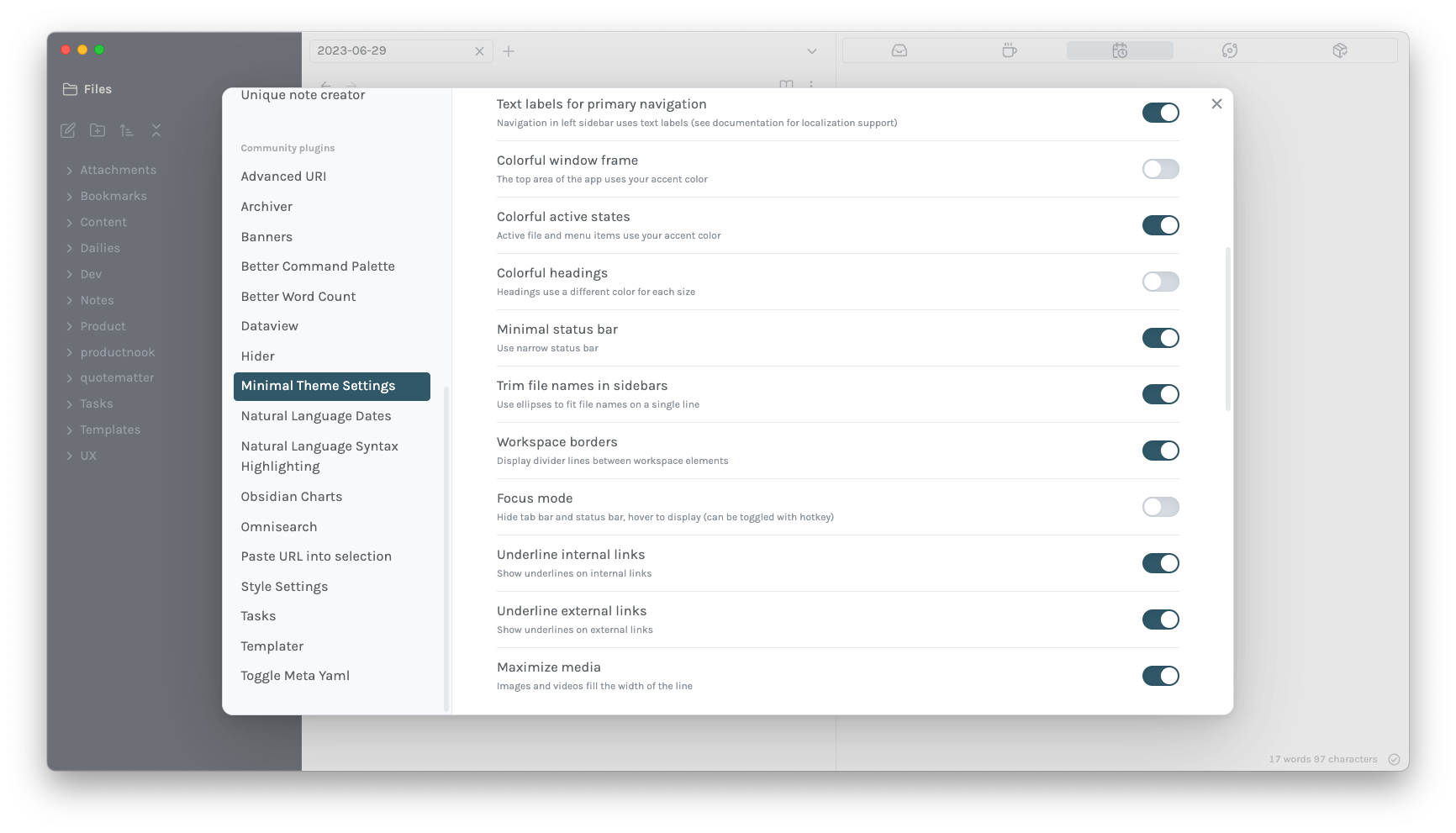
I've also enabled Text labels for primary navigation in Minimal Theme Settings so that Files sits nicely above my folder tree, rather than it being a separate button. You can download Minimal Theme Settings from the Community Plugins in Obsidian.
Aesthetics
Font Choices
Right now, I'm most partial to Karla and Rubik. I'll usually keep both the Interface Font and the Text Font the same for consistency. You can install both of these from Google Fonts and then adjust what Obsidian uses in Settings.
Color Schemes
These days, I find I can't focus as easily with a Dark Mode, so I've got Light Mode enabled practically everywhere. As for the color scheme, I use Ayu with a High Contrast background toggled on in Minimal Theme Settings. My other options are below, everything else is the defaults:
Style Settings
On that same topic, if you don't have Style Settings already, you can download it from the Community Plugins. It adds a ton of additional flexibility to themes that most community developers use in tandem with their theme releases. I've adjusted a few things here:
- Minimal > Active Line: Disabled. When you have files open in the right side bar, seeing the active line there is a bit of an eyesore.
- Minimal > Tab Style: Modern. Offers a cleaner look.
- Minimal > Sidebar Tab Style: Modern Wide. Offers a cleaner look.
- Advanced Settings > Styled Scrollbars: Enabled. I find this adds some uniformity across the interface.
Callouts
One thing about Minimal that I don't like the default look of are the callouts. I've made some subtle changes here add some more rounded corners. To do the same, use the following CSS snippet:
.callout {
  border-radius: 8px;
  border-width: 1px;
}
With that added, your callouts should look like this. You can always make additional adjustments to the snippet to define your personal look.
If you want to define custom callouts, you can use the following snippet, adjusting the data-callout name to whatever you want that snippet to be. The callouts have Lucide support out of the box, so you only need to add the name of the icon here:
.callout[data-callout="contacts"] {
    --callout-color: 246, 189, 96;
    --callout-icon: lucide-users;
}

.callout[data-callout="documentation"] {
    --callout-color: 132, 165, 156;
    --callout-icon: lucide-scroll;
}
In-List Callouts
To make your lists stand-out from your standard callouts, and for some added visual separation, consider becoming a Supporter to view our Supporter Content on List Callouts.
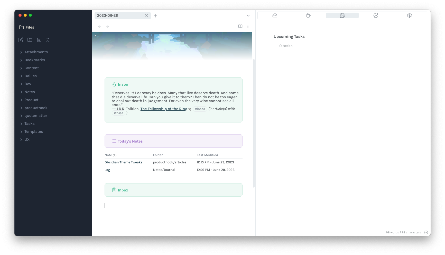
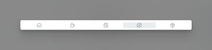
Right Side Bar Icons
If you followed my Obsidian Task Management articles, you'll know I have task summaries on my right side bar. These are pinned so that if I open a note while working within it, the new note opens in the main pane instead of "overwriting" what's open on the side bar. For a cleaner look, you can add icons to specific notes using CSS. Here's an example for my "Inbox" note.
.workspace-tab-header[aria-label="Inbox"] .workspace-tab-header-inner-icon svg {
    -webkit-mask-image: url("data:image/svg+xml,%3Csvg xmlns='http://www.w3.org/2000/svg' width='100%' height='100%' viewBox='0 0 24 24' fill='none' stroke='currentColor' stroke-width='2' stroke-linecap='round' stroke-linejoin='round' class='lucide lucide-inbox'%3E%3Cpolyline points='22 12 16 12 14 15 10 15 8 12 2 12'%3E%3C/polyline%3E%3Cpath d='M5.45 5.11 2 12v6a2 2 0 0 0 2 2h16a2 2 0 0 0 2-2v-6l-3.45-6.89A2 2 0 0 0 16.76 4H7.24a2 2 0 0 0-1.79 1.11z'%3E%3C/path%3E%3C/svg%3E");
    color: var(--icon-color);
    background-color: var(--icon-color);
}
These don't have Lucide support, so if you want to use Lucide icons, you'll have to do some extra steps: In my case, I copy the SVG link from lucide.dev and encode it here. Use the Ready for CSS section, and change the width and height to 100%, as seen in the snippet above, so that the icon is filled out. Don't forget to adjust the Style Settings from before so that these are displayed as below:
Let me know what you think in the comments below.


Discussion